|
Using WPF for
Good and Not Evil
By David S.
Platt
Head Honcho,
Rolling Thunder Computing
(download .docx format copy)
Introduction
Forests of trees, oceans of
ink, galaxies of innocent electrons, have been
slaughtered in order to show application designers
how to
program this or that feature of
WPF: how to
program a color gradient, for example, so the color
transitions smoothly from one value on one side of
the window to another value on the other side; how
to animate an item, to make it move while the user
watches in spellbound admiration; how to alter the
appearance of a control without altering its
behavior, and so on.
Far less has been written about
what
should be done and what shouldn’t, or
when
something should be done and when it shouldn’t, let
alone why.
Animation is now easy, but where and when does it
enhance a user’s experience and where and when does
it degrade it? Under what circumstances do color
gradients help or hinder a user’s perception of
information? The attention given to how overtops the
attention given to what and where and when and why
by a factor of at least 100. And that’s wrong.
WPF is more powerful than
Windows Forms, as a chain saw is more powerful than
a hand saw. This increased power allows you to
accomplish more useful work. However, it also
increases the need for great care in employing the
powerful tool. You can’t hurt yourself too badly
with a hand saw compared to what you can do with a
mishandled chain saw [1].
I see enormous exultation over the power of WPF, and
the exulters are absolutely correct about the
magnitude of that power. I see darn near zero
discussion of the careful thought needed to safely
and productively manage that power to make users
happy, which is the final result that we care about
accomplishing. This paper is my attempt to lay out
the fundamental principles and begin that
discussion.
Sample Application
This white paper examines the
Family.Show (hereafter FS) genealogy sample
application, shown in Figure 1.
This is a
reference sample application commissioned by
Microsoft and written by Vertigo Software to
showcase the capabilities of WPF. The application
and its source code are online at
http://familyshow.codeplex.com/ . For “how-to”
advice, it succeeds quite admirably.
Figure 1 Family
Show Application
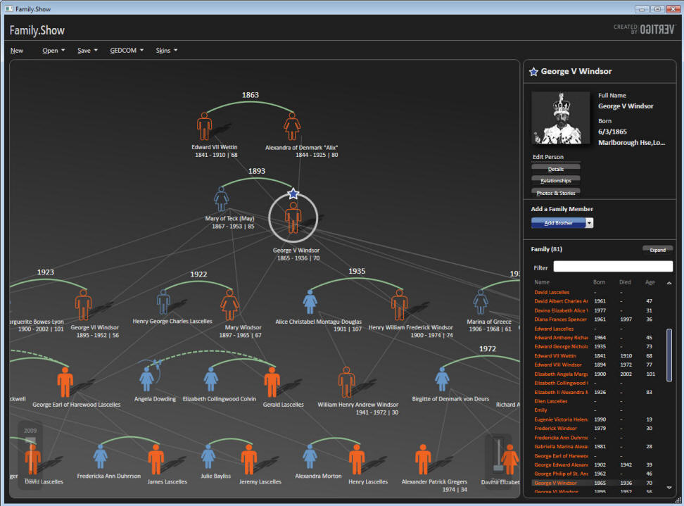
FS was written from the
technology outwards, not from the user inwards. As
Vertigo’s CEO said in a
Channel 9 interview
[2],
“Let’s take some new technology and find a business
problem.”
As you will see, FS uses some new features of
WPF to accomplish wonderful things that make the
user happier than he would have been before WPF.
As you will
also see, FS uses the exact same features to
accomplish some not-so-wonderful things that make
the user less happy than he would have been before
WPF. The same feature of WPF is used both for good
and for evil in the same application. In a way, that
makes FS an even more valuable demonstration program
that it would otherwise have been.
Three Fundamental Principles
I majored in physics as an
undergraduate, and there’s still enough of the
physicist in me to insist on setting forth the
fundamental principles from which I derive my
judgments as to good and bad usage. I judge what is
good about an application and what is bad by
applying the following three principles, which I
call Platt’s Programming Principles (P3)
:
First Principle: That the
software that you write has zero value in and of
itself. You write software for one reason and one
reason only: to create value by making the user of
your software happier than he would be without your
software.
The only value that your software ever has or
ever will have is the degree to which it increases
the happiness of its users. It is extremely rare
that users are willing to pay for software that decreases their overall
happiness. [Don’t touch that line.]
Second Principle: That computer
programs increase the happiness of users in one of
two ways. The
majority of applications help a user solve a
specific
problem – writing an email message or an article,
buying groceries or an airplane ticket, viewing a
bank statement and paying bills. The user’s only
goal in using this type of program is to finish the
task and get on with his life, or at least on to the
next task. The faster a program converts a task from
not-finished to finished, the happier the user will
be. Completing a task in 10 minutes is better than 11 minutes, and 9
minutes is better than 10. Examples of this type of
application are Microsoft Office, Visual Studio, and
Money.
The second way in which a
program increases a user’s happiness, less common
than the first, is by putting the user into a
pleasurable state that he wants to maintain as long
as possible, or at least as long as it remains
pleasurable.
Games fall into this category, as do media
players. My favorite example of this type of
application is Skype, with which my daughters (ages
6 and 9) make video phone calls to my parents.
Third Principle: That in
neither of these cases do users want to think about
the programs they are using.
At all. Ever. In the former case, they want
to think about the problem they are solving: the
wording of the document they are writing, or whether
they have enough money to pay their bills, and which
unpaid creditor would hurt them the most.
They don’t want the program to distract them
from the problem they’re thinking about.
If they want to goof off and waste time,
they’ll bring up Solitaire, not admire the flashing
video buttons in the word processor. In the latter
case, the users want to get into that pleasurable
state as quickly as they can and stay there as long
as they can. Anything that delays the start of their
fix, or distracts them from it while they’re
enjoying it, is even less welcome than the
interruption of a work task. My parents want to see
and talk with and gush over their grandchildren, and
my children their grandparents. Any attention that
the program diverts from this purpose to itself is a
negative.
To summarize these three
principles: Users doesn’t care about your program in
and of itself. Never have, never will. Your mother
might, because you wrote it and she loves you, and
then again she might not; but no one else does.
Users care only about their own productivity or
their own pleasure. Every single user of every
single program wants what Donald Norman calls
The Invisible
Computer, in his landmark book of that title.
With these principles in mind, let’s go examine
Family.Show.
Color Gradients
The human eye can discern and
the human mind can quickly integrate an enormous
amount of information from different shades of
color. Figure 2 shows a superb example, Princeton
Professor Robert J. Vanderbei’s map of the US
presidential election results from 2004, which uses
color gradients to express popular vote percentage
by county [3].
Complete red indicates 100% Republican, complete
blue is 100% Democratic, and a smooth mix of the two
represents intermediate percentages.
You can see, for example, that California’s
coastline is highly Democratic but its interior is
much more Republican. The Texas Panhandle is red but
the Rio Grande Valley is blue, with a small blue
enclave around the state capital of Austin, and so
on.
Figure 2 Purple
America, 2004 Presidential Election, by Robert J.
Vanderbei. Used under Creative Commons license.

The right side of your brain
absorbs this information very, very quickly, in
parallel, as it were.
It’s a mainline into the depths of your mind.
If you had read these numbers from a list and
thought about them rationally with the left side of
your brain, you couldn’t integrate anywhere near as
much information anywhere near as quickly.
Presenting information in this way is fundamentally
different in kind, not just in degree, from the
left-brain way.
Now that I’ve demonstrated the
immense leverage that this simple pattern exerts on
a user’s brain, it shouldn’t surprise you that
sometimes color gradients get used well and make the
user happier, and other times they backfire and
accomplish the opposite. Let’s look at the use that
FS makes of color gradients.
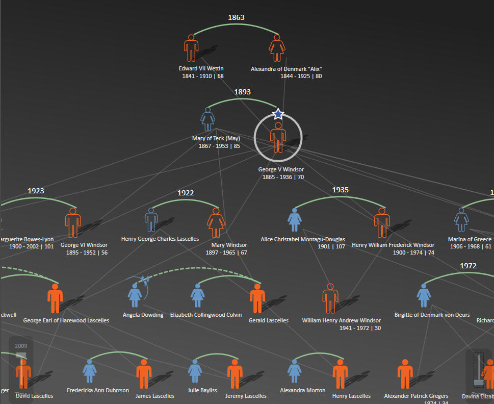
The family tree view (the left
panel in Figure 1, close-up shown in Figure 3)
contains a vertical color gradient. It’s darker at
the top and lighter at the bottom. This is an
excellent use of a color gradient, a poster child
for demonstrating what gradients do well and the
correct time and place and manner in which to use
them. As the user’s eye moves from the top of the
page to the bottom, the background color doesn’t
just change, it
progresses
in a way that the user’s right brain instinctively
understands. This indicates to the user that the
data displayed on that background progresses in some
meaningful way, which it does – earlier generations
are at the top of the screen, later ones at the
bottom. Furthermore,
the dark shade at the top indicates the dark of the
past, and the lighter shade at the bottom indicates
the light of today. In a subconscious, right-brain
way, the program is telling the user the axis along
which data progresses (vertical), and the direction
of that progression (later is down, earlier is up).
See how many words it took me to explain to your
left brain what your right brain instinctively
deduced from the color flow? And it’s still not as
effective.
Figure 3 Close-up of
Family Tree View
The gradient presents the idea at first
glance and then reinforces it with every scan of the
user’s eyes. This
gradient is not a mere stylistic element, it
enhances the user’s experience in an important way
by explaining the program’s layout to the user’s
subconscious mind. The user feels more comfortable,
more at ease with the application. He probably won’t
know why, and he certainly shouldn’t have to think
about it; but
it makes him happier and more productive and
therefore is good.
Now for the flip side, quite
literally, of this excellent use of a gradient,
compare the tree view pane with the details pane
(the right side of Figure 1, close-up in Figure 4)
Figure 4 Close-up of
Details Pane
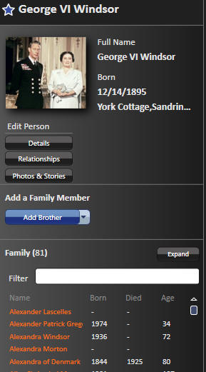
Here the gradient runs
horizontally, light on the left to dark on the
right. Perhaps the graphics designer thought, “I’ll
make this gradient horizontal to show the user it’s
a different panel used for a different reason.”
Or perhaps the programmers just wanted to
show how to program a horizontal gradient since they
had already shown how to program a vertical one.
Unfortunately, this is a really bad use of a color
gradient, as bad as the vertical one is good, or
maybe even worse.
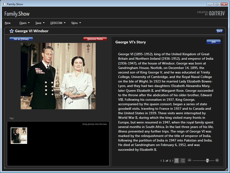
This is most apparent when you look at Figure
5, which shows the Photos and Stories view.
Figure 5 Photos and
Stories View
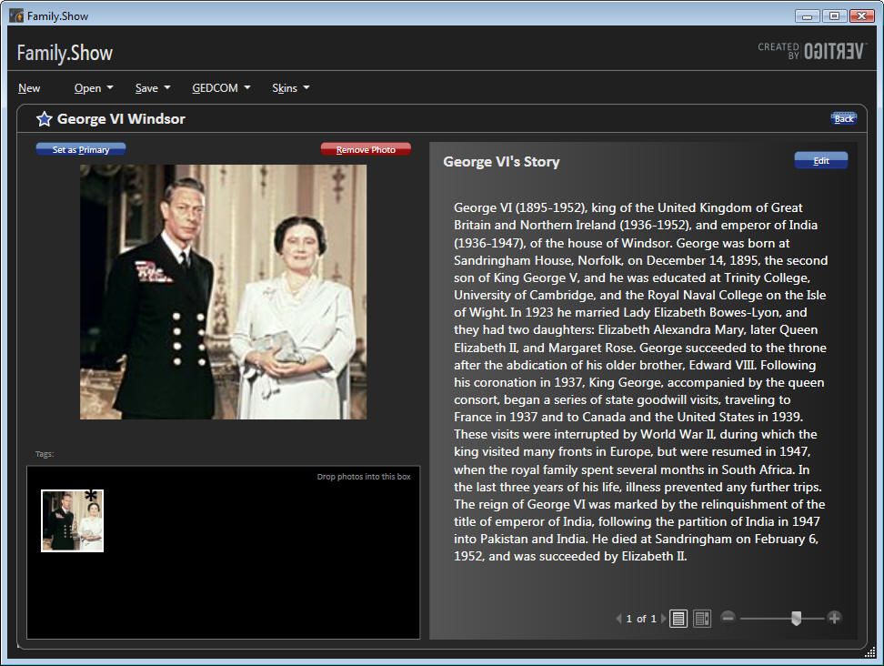
Look at the text in George VI’s
story. The background is light on the left side,
dark on the right. That indicates to the user’s
subconscious mind that the data changes in some way
as his eye moves in that direction, but this data
doesn’t. There’s no difference in the meaning of the
data from the beginning of the line of text to the
end. This gradient is lying to the user. Not only is
it lying, but it’s undermining the job done by the
good gradient in the family tree panel. The user
feels a tension from some parts of the program
telling the truth and while others
lie. That’s bad.
And it gets worse when you try
to actually read the text (which is not an edge
case, that’s what a user normally does with text).
At the start
of each line, your eye has to acquire focus on the
low contrast text, white on a light gray background.
We’ve been showing text in graphical environments
for decades; how can anyone who claims knowledge of
this domain have failed to learn that low contrast
is hard to read and therefore bad? [4]
And after you’ve squinted your way to the low
contrast beginning of the line, the gradient sticks
the knife in. As your eye scans the text from left
to right, the contrast gradually increases, and your
eye has to constantly adjust, adjust, adjust to the
constantly-changing contrast. Then, at the
high-contrast right end of the line, your eye snaps
back to the left end, has to readjust to the sudden
contrast change, and then reacquire the low-contrast
beginning of the next line. This gradient makes the
user less happy and less productive and therefore is
bad. Even a low-contrast uniform background would
have been better.
When I demonstrate this
application in a talk, I show this figure to my
students, and say, “Start reading these lines of
text and raise your hand when you feel the first
pain.” The average number of lines of they can get
through is about four. Try it yourself now, and see
how far you get. Now compare it to Figure 6, in
which I’ve replaced the gradient with a uniform
background. Which can you read more quickly, and
which can you tolerate for a longer time?
[5]
Figure 6 Photos and
Stories View Modified to Remove Horizontal Gradient
The left-hand vertical gradient
gives the user good and useful information very
quickly. The right-hand horizontal gradient lies to
the user, and then inflicts physical pain on him in
under 60 seconds. As Jeffrey Katzenberg, CEO of
DreamWorks Animation, famously observed about
three-dimensional movies: “Making your customers
sick is not a recipe for success.”
Motion
Probably the most frequently
demonstrated feature of WPF is its capacity for
displaying motion.
Windows couldn’t do that
natively
before WPF, so designers who needed motion had to
use various add-on packages with all their attendant
complications. Now motion is much easier to program,
so it will get used more often. Should it? Or
phrasing the question more precisely, under what
circumstances does motion enhance a user’s
throughput or pleasurable state, and therefore is
good; and under what circumstances does it degrade
them, and therefore is bad?
Motion attracts a user’s
attention. Natural selection brutally pounded that
design pattern into the human brain and visual
system. Our savannah-based ancestors that noticed
the twitch of the saber-tooth tiger behind the tall
grass avoided being eaten and passed their attentive
genes on to their descendants. The ones who didn’t
notice the motion got eaten, and didn’t.
Every single
user is the inheritor of roughly 13,000
generations
of homo sapiens who noticed motion better than the
ones who didn’t make it.
There are times and places in
which motion communicates ideas to the user as
nothing else can. In games, for example, the tank
churns around the battlefield or the pinball bounces
off the bumpers. Planetarium programs show the
movement of the heavens. The dishwasher serviceman’s
laptop shows how to disassemble the unit, swap out a
part, and put it back together. A chemical process
monitor shows the rising and falling levels of
reagents in the tanks and the spinning of pumps and
fans. At the right time and the right place, saying
the right thing to the right user, it’s absolutely
fabulous, life-and-death important. It’s another
mainline into the user’s brain, in the same manner
as the color gradient, but even more powerful.
Precisely because of this
power, it shouldn’t surprise you that misused motion
can harm the user experience more than anything
else. Imagine if the clock at the lower right corner
of the Windows task bar showed the seconds digits
ticking away. Most users would find that
disquieting. On a telephone application such as
Skype, where you pay by the minute, perhaps; but not
on the main task bar that you stare at all day every
day. Now suppose it also showed tenths of seconds
spinning madly away. That’s even worse. On a
stopwatch application, perhaps; but not on the main
task bar. No one could ever get any work done. As
user interface expert Jared Spool wrote of his test
of a Disney web page containing an animated logo,
that corporate branding icon so beloved of
marketeers everywhere: “Users first tried to scroll
the animation off the page, and when they couldn’t,
actually covered it up with their hands so they
could read the rest of the text.”[6]
I would have paid money – in fact, would still pay
money – to see him show the video of that test to
the president of Disney. He’d probably strap the
designer into a straitjacket and force him to ride
“It’s a Small World After All” for two solid days
before allowing him to drown himself. A designer
that says, “users will just ignore motion that they
don’t like,” does not understand the human animal.
If you look at my list of
scenarios that use motion well, you’ll see that they
use motion on the display screen to represent motion
in the world (real or imaginary) to the user. In a
line-of-business, data entry and viewing application
such as FS, though, the case for motion is less
obvious. Designers strive mightily to shoehorn it in
somewhere, desperate to play with the shiny new toy
in their toolbox and appear cool to their peers and
their own self-images, but its benefit to the user
is much harder to find in this kind of application.
Family trees don’t change that often, and
real-time
tracking is rarely necessary.
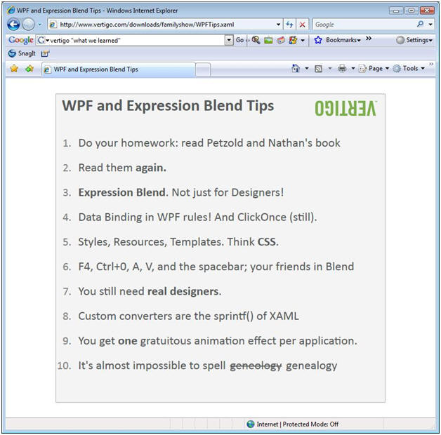
Figure 7 shows Vertigo’s list
of “10 Things We Learned” in writing this
application. Number nine is “You get one gratuitous
animation effect per application.” No, you don’t.
Dictionary.com defines the ‘G’ word as “being
without apparent reason, cause, or justification: a
gratuitous insult.”
Figure 7 Vertigo's List
of 10 Things We Learned
I’m sorry, but that’s not
acceptable to inflict on a user.
As with the
color gradient, you are bypassing the user’s
socialized, rational left brain and reaching deep
into his right brain, in a much more intimate way
than computer programs ever did before.
Your program’s motion triggers a user’s
saber-tooth tiger detection mechanism. To misuse
this communication channel is to disrespect the
user. They won’t tolerate it, and shouldn’t be asked
to. And from a purely mercenary standpoint, it’s too
powerful to waste. Let’s see how FS uses motion.
When you click on a person in
the family tree pane, FS highlights that person and
shows additional information about him in the
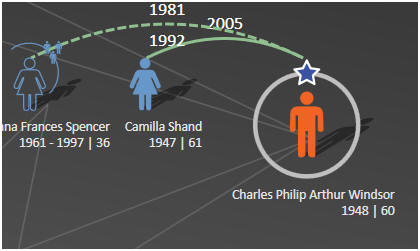
details pane on the right. FS uses effective
highlights to indicate the selectee, a larger icon
and a circle and a star (Figure 8). This pattern of
selection and detail views is common to many Windows
applications. The selection view in FS is larger and
the details view smaller than usual, but the shape
of a family tree requires that ratio, and the user
takes it in without a problem. So far, so good.
Figure 8 Highlighting
of Selected Person
In addition to displaying the
selectee’s details, FS moves people around to
different locations on the family tree. The selected
person moves to the rightmost end of his
generation’s line, placing him next to the details
pane. I find this confusing on two levels. First,
the thing that I clicked on jumped away from me,
which is the last thing any user expects. I can’t
immediately think of another program in which that
happens, other than one I wrote as a joke in my
misspent youth. It was hysterically funny, for about
three seconds. I’m afraid I can’t repeat my boss’s
language after the second time my program did that
to him. Second, a family tree usually shows siblings
in order of age, from left to right or occasionally
right to left. When the selectee moves, this order
becomes scrambled for that generation line. Usually
George VI is next to his younger sister Mary, but if
he’s selected, he moves to the right end and Edward
VII is next to Mary. Moving the selected person to
the right end confuses the picture more than it
clarifies it.
After transferring the selectee
to the right end of the generation line, FS closes
the previous selectee’s descendants and opens as
many of the new selectee’s descendants as it has
room for.
This makes sense. The user selected a particular
person because he wanted to see more information
about him, and the descendant tree is the most
important piece of that information. This changes
the size of the displayed family tree, often by a
large amount. George VI has three levels of
descendants, maybe four if the rumors about Prince
Harry are true; Edward VIII has none. FS now runs an
animation in which the new family tree slides into
the center of the pane from one of the edges. Again,
I find this confusing. The tree slides in from
different edges of the pane without apparent rhyme
or reason; sometimes from the bottom, sometimes the
top, sometimes the left; sometimes more or less
orthogonally, sometimes diagonally.
If you click Edward VIII, it slides in from
the upper left, but if you click his younger brother
George VI, it slides in from the lower left. I
thought it might have had something to do with the
presence of children (George had two, Edward none),
but if you click on Edward’s wife Bessie Wallis
Warfield (no children), it slides in from the lower
right. In addition, the center of the new tree, both
horizontally and vertically, moves to the center of
the tree display pane.
That may
sound logical as you read it, but this often causes
the selectee’s generation line to move up or down
from where it was when the user clicked on it. And
nothing else is where it used to be either, because
the selectee’s ancestors move up or down as well. I
clicked on a person because I wanted to see that
person’s details, not because I wanted to
reconfigure the entire display. Now I have to
visually reacquire the entire tree and visually
reorient myself. The motion scrambles my mental
picture, every single time. And it gets worse.
I said above that the last
thing that any user expects when he clicks on
something is that it’ll slide away from him. I need
to retract that statement. There’s one thing in the
world that the user is expecting less. And that is
for the item that he’s clicked on to disappear
entirely. Yet
that’s what sometimes happens with FS’s re-centering
animation. The
selectee’s details appear in the details pane, but
switching the selectee to the right end and then
re-centering the tree sometimes causes the selectee
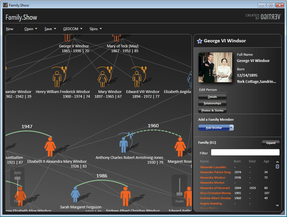
to slide out of sight under the details pane. In
Figure 9, you can see George VI in the details pane,
you can see his wife in the tree view, but you can’t
see him on the tree view. He slid out of sight,
under the details pane, when I selected him.
If that’s not
a violation of the Principle of Least Astonishment[7], I don’t
know what is.
Figure 9 Selected
Person Scrolled Off Screen by Automatic Re-centering
What do you think the user says
to himself when the family tree slides around? Does
he say, “Wow, it moved! How cool! I’m using the
latest technology, hot diggety dog, life is good! Do
it again, will ya?” Or does he say, “Hey, I just
clicked on this guy and he disappeared. What the
hell?” I can just see the tech support person
answering the phone call: “I clicked on this guy,
and he disappeared! No, I DIDN’T press delete! Where
the [expletive] did he go? … Only two drinks, why do
you ask?”
When I looked into the source
code, the direction of the motion comes from the
internal organization of the family tree and the
display pane inside the program. It doesn’t have
anything to do with expressing meaning to the user.
Yet motion cannot help but scream into a user’s
brain and trigger a search for meaning (“where’s
that tiger?”), causing internal frustration if none
can be found. If you don’t believe me right now,
think how annoyed you get on the highway when you’re
following a car whose driver has left his turn
signal on.
Clearly, Vertigo wanted to demonstrate how
one went about programming motion into an
application, not to demonstrate the motions that
would make a user happier or more productive.
What sort of motion would make
a user happier in this situation? Opening the selected person in place would be a
better idea. The selectee is shown with a larger
icon, perhaps its size could smoothly increase with
a very short animation, not more than one or two
tenths of a second. The icon would seem to move
towards the user, thereby reinforcing the message of
selection. The
previous selectee would shrink back to normal size,
hence appearing to move away from the user, again
reinforcing the new selection. Perhaps the siblings
on either side would slide to the left or right to
make room for the larger icon of the selectee,
maintaining the left-right sibling order which does
carry a meaning. The descendants of the previous
selectee would be closed and those of the current
selectee opened. Nothing would change on the levels
above the selectee, and the user wouldn’t have to
reacquire the entire tree.
This design would use a whole
lot less motion, but that small amount of motion
would carry genuine meaning into the user’s brain.
I don’t see
how it makes a user happier or more productive to
see a large amount of randomly varying motion that
even its creator describes as gratuitous.
Re-Looking of Controls
WPF’s architecture separates a
control’s behavior from its appearance. A designer
can radically alter a control’s visual appearance in
XAML without changing its behavior, an action called
“re-looking” a control, or sometimes “skinning” the
control. As is the case with the rest of my
examples, FS handles the re-looking of controls well
in some cases, and not so well in others.
For the done-well, look at the
people on the family tree view, back in Figure 8.
This small picture conveys a lot of information to
the user. The shape tells you male or female, the
fill tells you whether they’re alive or dead, the
color specifies a blood relationship versus a
marital relationship and so on. The arched line
shows a marriage, invoking an arm around a shoulder,
dashed for previous, solid for current. The current
selectee is shown larger, with a circle around it
and a star on top, naturally grabbing your eye.
Again, these symbols speak quickly to the right side
of the user’s brain. If the only indicator of a
person’s sex were the letters M or F, you’d have a
much harder time getting them into your brain.
Besides using these pictures
for display, FS needed to make them clickable. If
each picture had a regular button below it for
selecting it, the tree display would have been much
busier and harder to grasp.
If you look
at the source code, you’ll find that Vertigo has
implemented the clickable pictures by re-looking the
button control – the class DiagramNode derives from
Button. It required a lot of XAML from a designer,
but surprisingly little C# code. Along with that
good symbolic representation, the clicking behavior
is exactly that of the button from which it derives,
as are its other properties – for example,
highlighting when the mouse hovers over it, popping
up a tooltip after a delay, and so on. The user
doesn’t know that the node is actually a button
inside, doesn’t want to know, shouldn’t be and isn’t
asked to know. The user thinks he’s clicking on a
person, and he is. This is a really good example of
what you can accomplish by changing the look of a
control and inheriting its previous behavior.
On the other hand, look at the
buttons that look like regular buttons, such as
Figure 10. The graphic designer got, IMHO, a little
too fancy here. The top of the button differs in
color from the bottom for no apparent reason. The
low contrast between the bottom of the button and
its background makes it hard to see where to click.
The low contrast between the white text and the
light-blue top is hard to read, and the abrupt
change in contrast between the lower and upper
halves of the button makes it harder.
It’s a
little better in the silver skin because the three-d
effect happens at the bottom of the button and there
isn’t a mid-line cutting through the text (Figure
11), but the contrast is still low, and the
fonts are small and slender. And the contrast of the
menu buttons, dark gray text on a medium-dark gray
background (Figure 12), is terrible.
Figure 10
Figure 11
Figure 12
Black skin button
Silver skin button
Silver Skin Menu Button


.
In the
Channel 9 interview of the design
team, the creative designer looks barely old enough
to shave, and the CEO isn’t that much older, he
still seems to have all his hair. This
app was written for young eyes. The buttons
that look like and actually are buttons need to be
done differently, as you’ll see when you think about
who the users of genealogy applications actually
are. To those neglected users we now turn our
attention.
Thinking About Users
Platt’s First, Last, and Only
Law of User Experience Design states, “KNOW THY
USER, FOR HE IS NOT THEE.” Unless you are writing
applications for the use of burned out computer
geeks, your user is not you.
They are very, very different from you, in
ways that are hard for you even to imagine[8].
So who are the users of genealogy applications?
Short answer: older people. I
had a long discussion about his customer base with a
client of mine who works on commercial genealogy
applications. I’m not allowed to give specific
breakdowns, but essentially none of their users are
younger than 50 years old, and many of them are much
older. Genealogy is the fastest growing hobby today
precisely because this is the fastest growing age
group. Young people are much more interested in
finding a partner with whom to create descendants
than in writing down their ancestors. Only as they
cross the watershed of half a century, with children
out of the house and grandchildren at least on the
horizon, childhood pets dead or at least doddering,
do people start thinking about leaving a record for
posterity[9].
Not until they; we; dammit,
I ; feel
that first chill breeze of mortality do we start
agreeing with poet and funeral director Thomas
Lynch, who wrote thusly about his wishes for his own
funeral: “All I really wanted was a witness. To say
I was. To say, daft as it still sounds,
maybe I
am.”[10] That’s
why people buy and use genealogy software, and
that’s the stage in their lives when they start
doing it. If you think a flashier genealogy
application would tempt 20-somethings out of the
dance bars on a Saturday night, you’ve forgotten
your own 20-something years.
What do older people like and
dislike in their applications? What makes them
happier or less happy compared to what pleases or
doesn’t please younger users? For starters, older
users have trouble with near vision, as the lens of
the eye loses its elasticity with age. The ability
to focus on near objects drops from about 10
diopters in a young adult to about 1 diopter by age
fifty[11].
Essentially every user of this application is
in a large-print stage of life, although few of us
like to admit it. The subconscious right-brain cues,
such as the color gradients and the person outlines,
become even more important as the reading of text
gets harder. Conversely, obstacles to reading text,
such as the horizontal color gradient or low
contrast or small fonts, get even more obstacular.
It’s not only the physical
requirements of this audience that an application
designer needs to consider. This audience has
different mental requirements as well. The president
of a senior citizen user group to whom I recently
spoke wrote me that [capitals hers, italics mine],
“PLEASE remember that as seniors,
we hear and
digest things slower than young adults.
You MUST speak slower than you would if
presenting to a younger group.”[12]
Imagine how confusing the constant repositioning of
the selected person and the re-centering of the
family tree must be for this user population.
Conversely, think how helpful a smaller, consistent,
easily understood piece of motion would be. The age
of the user population amplifies both good and bad
design choices – the good symbolic communication
that FS does becomes even better, and the bad
communication gets even worse.
Look at Figure 7 again, “Things
We Learned.” Every single one of them discusses how
to implement this or that feature of WPF. Not one of
them deals with any notion of who the user is, what
problems the user is trying to solve, what
pleasurable state the user wants to enter. It
contains nothing about what the user loves, what the
user hates, what the user is willing to tolerate,
what the user can and can’t do; how we’re going to
please the user in order to separate him from his
money. The “U” word does not appear, not even once.
And that, my friends, is what needs to change
in today’s software world. We need to work
from the user inward, not from the toolkit outward. Because the same
technology that can delight the user can also
infuriate him, and vice versa.
Conclusions
WPF provides a completely
different way of communicating with the user of a
computer program, as different from the text-based
Windows Forms as video is from audio, as different
as parallel is from serial. This difference in
requires changes in the thinking of designers and
architects and programmers.
As a chain saw is more powerful
than a hand saw, both for good and for evil, so WPF
is more powerful than WF, both for good and for
evil. As we have to be more careful and skillful
with a chain saw to produce the results that we want
(a full cord of firewood cut in an afternoon)
without the bad consequences that we don’t want
(someone’s leg chopped off in a second), so we have
to be more careful and skillful with WPF.
The power is widely recognized; the
concomitant need for care and thought is not, and it
needs to be.
The Family.Show sample
application provides excellent instruction on how to
employ implement various parts of WPF. It also
shows, probably unintentionally, how the same WPF
feature can both help and harm a user’s experience,
depending on the time and place and manner in which
that feature is used.
Author Bio
David S. Platt teaches
Programming .NET at Harvard University Extension
School and at companies all over the world. He is
the author of eleven programming books. His
Introducing Microsoft .NET from Microsoft Press introduced thousands
of programmers to that environment. Even today, 5
years after its most recent release, it is
outselling Tom Clancy’s
Every Man a Tiger on Amazon.com, which tells you what kind of geeks
buy their books there. His magnum opus,
Why Software
Sucks (Addison-Wesley, 2006,
www.whysoftwaresucks.com), points out ways in which
software MUST improve if it’s to accompany humanity
into the twenty-first century. He is famous for his
engaging presentation style. "He’s the only guy I
know that can actually make a talk on COM’s
apartment threading model funny," said one student.
Microsoft named him a Software Legend in 2002.
Dave holds the
Master of Engineering degree from Dartmouth College.
He did his undergraduate work at Colgate University.
When he finishes working, he spends his free time
working some more. He wonders whether he should tape
down two of his daughter’s fingers so she learns how
to count in octal. He lives in Ipswich, MA.
Nickname: "The Mad Professor"
Favorite Web Site:
www.radomargaritaville.com
Comment most frequently
elicited from children at adjoining breakfast
restaurant tables before he’s had his morning
coffee: "Mommy, what’s wrong with that man?"
[3] Anyone
interested in further examples of using
color gradients to present useful
information very quickly will like
Vanderbei’s page
http://www.princeton.edu/~rvdb/JAVA/election2004/.
He shows similar charts for other elections
as well. For example, you can see how the
South and West favored Jimmy Carter in 1976
over Gerald Ford, and how the South stayed
true to Carter but the West defected to
Ronald Reagan in 2000. He adds green to show
the effect of George Wallace’s third-party
run in 1968, and so on. It is extremely well
done.
[4] Yes, there
are always obscure edge cases in which
low-contrast text is necessary –
interpretive signs in a historically
furnished museum room, for example, where
you need text to explain what the visitor is
seeing without intruding on the experience.
We’re not even close to that
situation here.
[6] Jared
Spool et. al.
Web
Site Usability: A Designer’s Guide.
Morgan Kaufman, 1999. Page 89.
[7] The
Principle of Least Astonishment states
simple that astonishing the user rarely
makes him happy, so you want to do it as
seldom as possible.
[9] My late
grandmother’s favorite joke tells of a
priest, a minister, and a rabbi debating the
moment at which life begins. The priest
smacks his hand down on the table and says,
“There’s no debate. His Holiness has
declared with papal infallibility that life
absolutely begins at conception.” The
minister says, “Not so fast, brother priest.
We ministers read our Bibles and attend our
conferences and participate in Internet
discussion groups, and through our
justification by faith alone, we’ve more or
less come to the general consensus that life
begins at birth.”The rabbi says, “You
goyim [gentiles] you’re all
meshuggeneh [crazy]. Our greatest
scholars have studied the Talmud and the
wisdom of the ancient rabbis, and come to
the inescapable conclusion that life begins
when the kids are through school and the dog
has died.”
[10] Lynch,
Thomas.
The
Undertaking: Life Studies From the Dismal
Trade. Penguin, 1997, pg 199.
[12] There’s a
good example in this very paragraph. You
probably took in the short phrase “capitals
hers, italics mine” at the beginning of this
quote with no trouble at all. I tried it on
several healthy, educated, literate seventy
year old people, and every one of them had
to parse it a few times to figure out what I
meant and decide if it mattered. If I didn’t
need it to make this point, I’d go back and
rework it.
|